· Ryan Moore
The Multi-Sensory Experiment

Over many decorated years, Ria had gained a broad perspective in research, development, quality assurance and competed in the 2016 New Zealand Coffee Brewers Cup and World Brewers Cup in Dublin. She was exceptionally passionate about drink products and the important part they play in our day to day lives and she was the first person to introduce me to Dr Charles Spence.
Now if you haven’t heard of Dr Charles Spence, I’m incredibly excited to be the first to familiarise you with his work. Dr Charles Spence is a world-renowned experimental psychologist, who specialises in the research of sensory modalities. In a nutshell, his research establishes the effects that sight, touch and sound can have on a perceived taste experience.

The Experiment
One of Spences earliest and most notable experiments in cross-modal food research was relating to potato chips and the importance of sound, the crunch, crackle and crispness and its impact on taste.
Charles and his team began to change the sound of the crunch whilst building the multi-sensory integration, this became known as the ‘sonic experiment’ and won the Ig Nobel award. Spence and his team were able to demonstrate that the sound made when biting into a Pringles crisp would affect people’s perception of how fresh the crisps were.
The louder and crisper the sound, it increased the perception of freshness by 15%. Not only that, why do think crisps always come in noisy packaging? Well, research shows that serving chips in louder packaging enhances their crunch. Mind blown?!
For a while, I consumed myself in Charles Spence, I was fascinated by his research and consequential results. It really interested me and at the time, I had just begun preliminary design on developing the Blendsmiths brand and early product prototypes.
The notion of how a shape, smell and colour of food / drink, its packaging and even the setting it which it was consumed started to affect my thinking on the direction in which the brand was to take.
For example, research has shown an overwhelming attachment to the colour red as ‘sweet, ripe and calorie high’, although you wouldn’t categorise chillies or red meat as that. Yellow is synonymous with sour, brown with earthy notes but the likes of blue food, we inherently are averse to, as it rarely appears in nature.
The overall experience of one particular matter can have a mind-blowing impact on generations to come, mix this in with a super brand and its ability to reach a massive audience, the overarching colour experience of a food can change everything. If you’re over the age of 30 like me, a blue drink would symbolise sugary bubble gum flavoured products or a slush puppy found at your local cinema. But remember the introduction of the blue M&Ms in 1995, the vast majority of the younger generation associate blue with raspberry. Hard to believe isn't it?! I love this.
The types of blends that we were synthesising were based around nature, health, vibrancy and excitement. We knew that the prominent ingredient within our blends would potentially face adversity, the likes of turmeric, beetroot aren’t necessarily attractive ingredients based on their individual state (even though when blended, a completely different proposition) but we knew the colour of the drink would propel excitement, vibrancy and attractiveness when prompting people to try.
Flavour profile is our number one priority but the colour of the final product had a significant bearing on which ingredients we used, where we sourced them from, the percentages used and how particular ingredients would amalgamate with others.

There is no denying that packaging has an influence on behaviour, with Spence estimating one-third of products are consumed directly because of their packaging. Sensory features have been thoroughly thought out for many years with major companies employing packaging psychologists to assist in directing consumers to choose and splash out on purchasing their products.
Unfortunately, we can’t afford to employ psychologists right now but use what knowledge we do have. We wanted the ingredients on show at all times, but were faced with de-colouring and quality issues when in contact with direct sunlight.
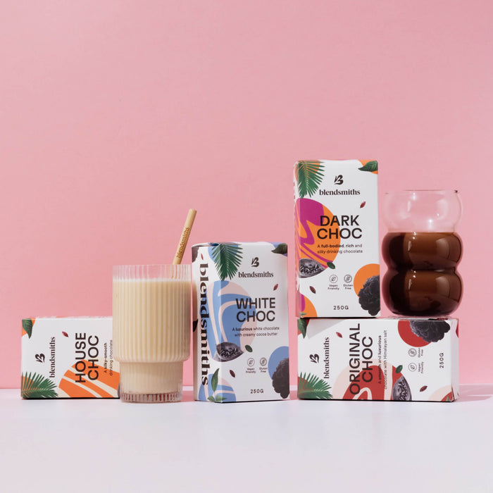
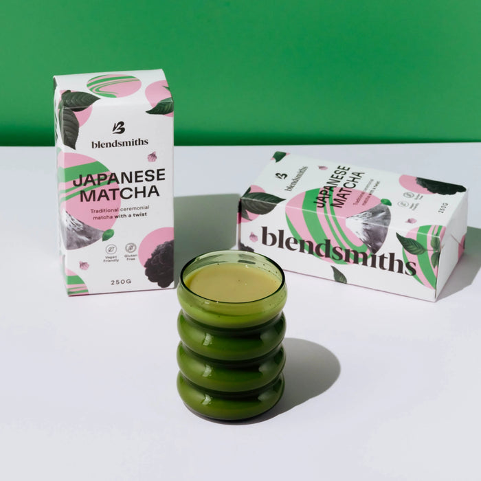
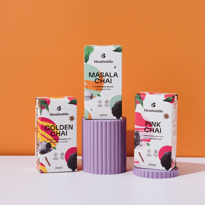
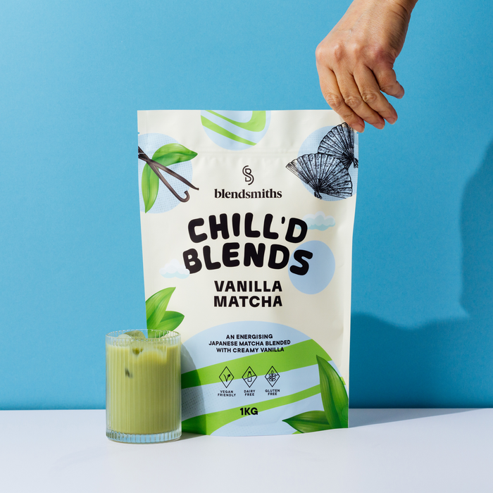
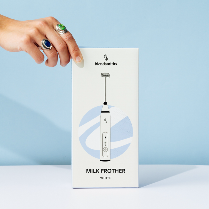
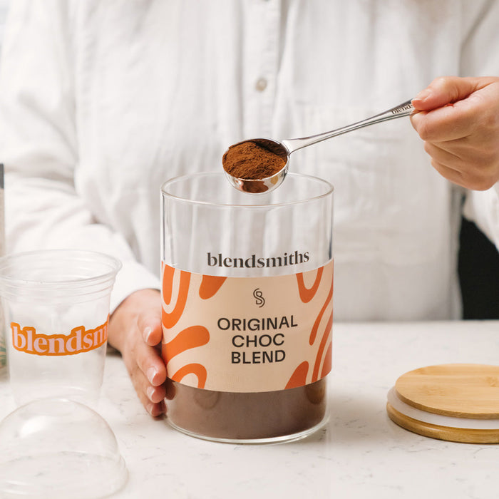
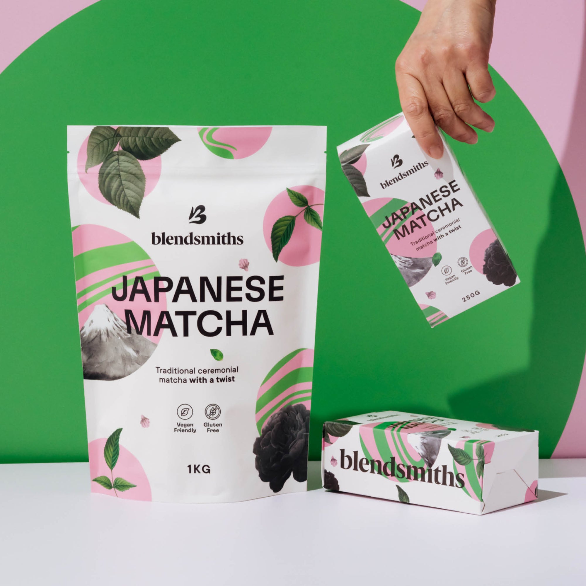
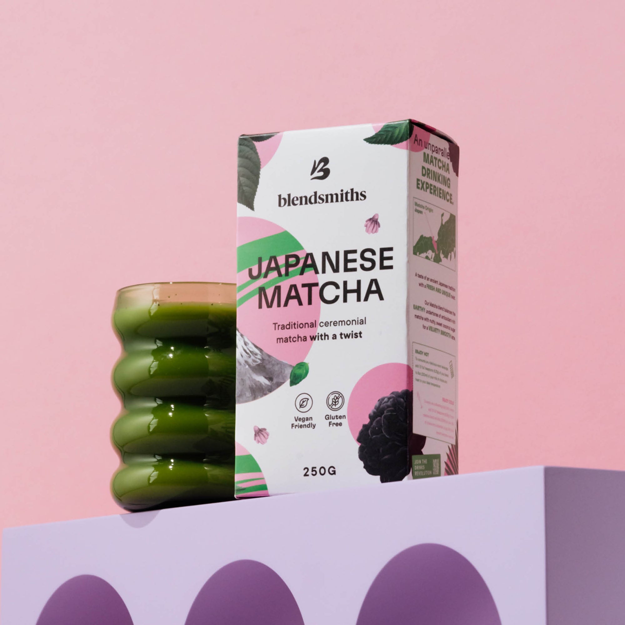
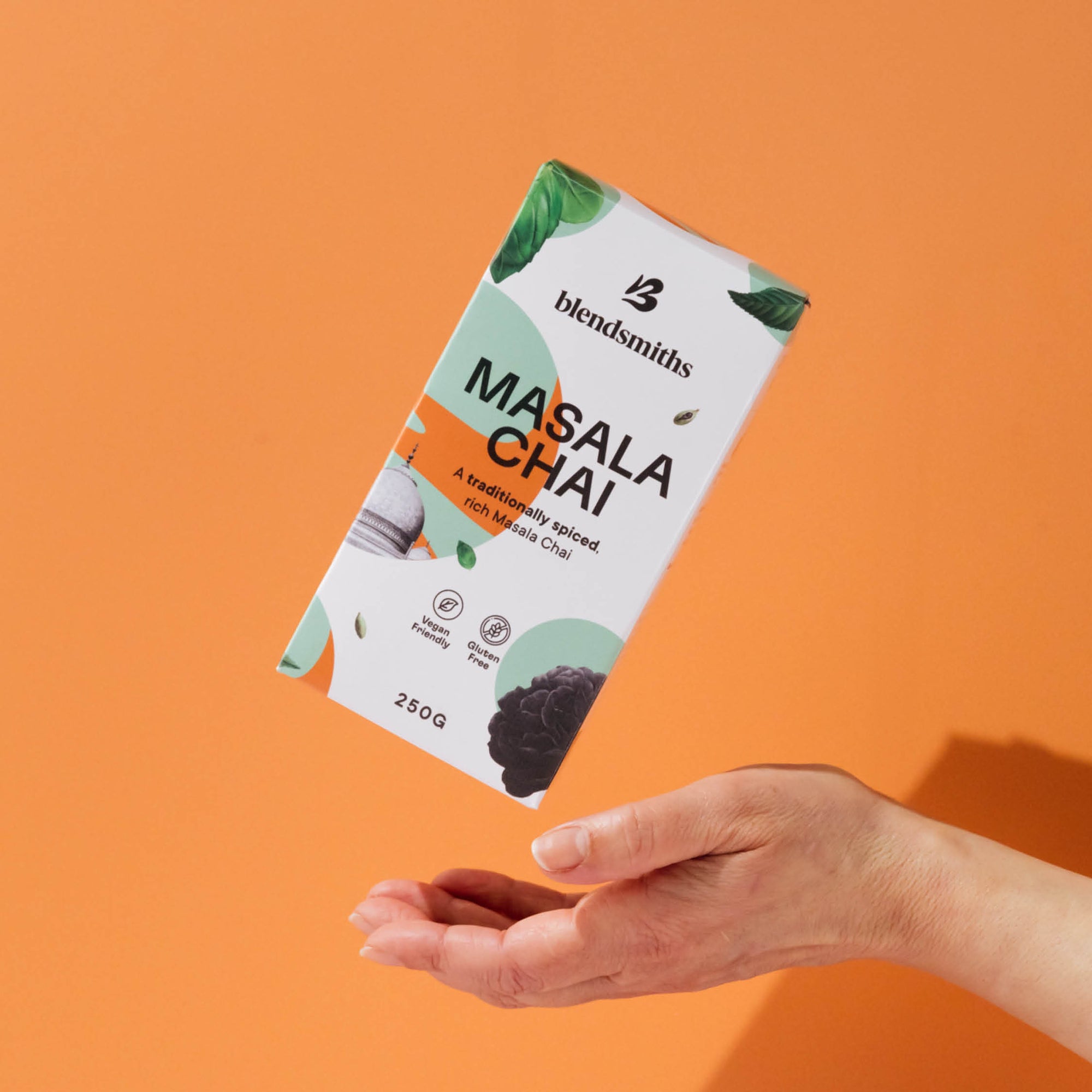
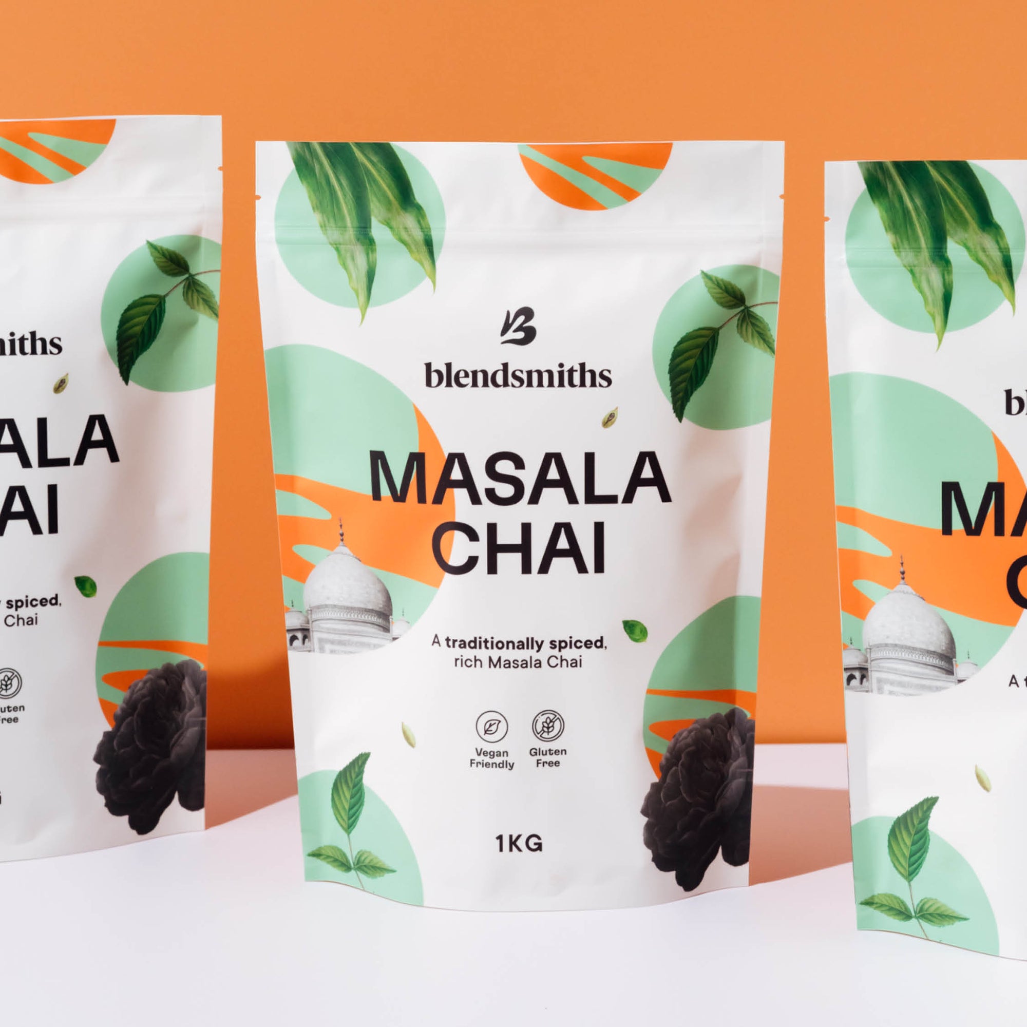
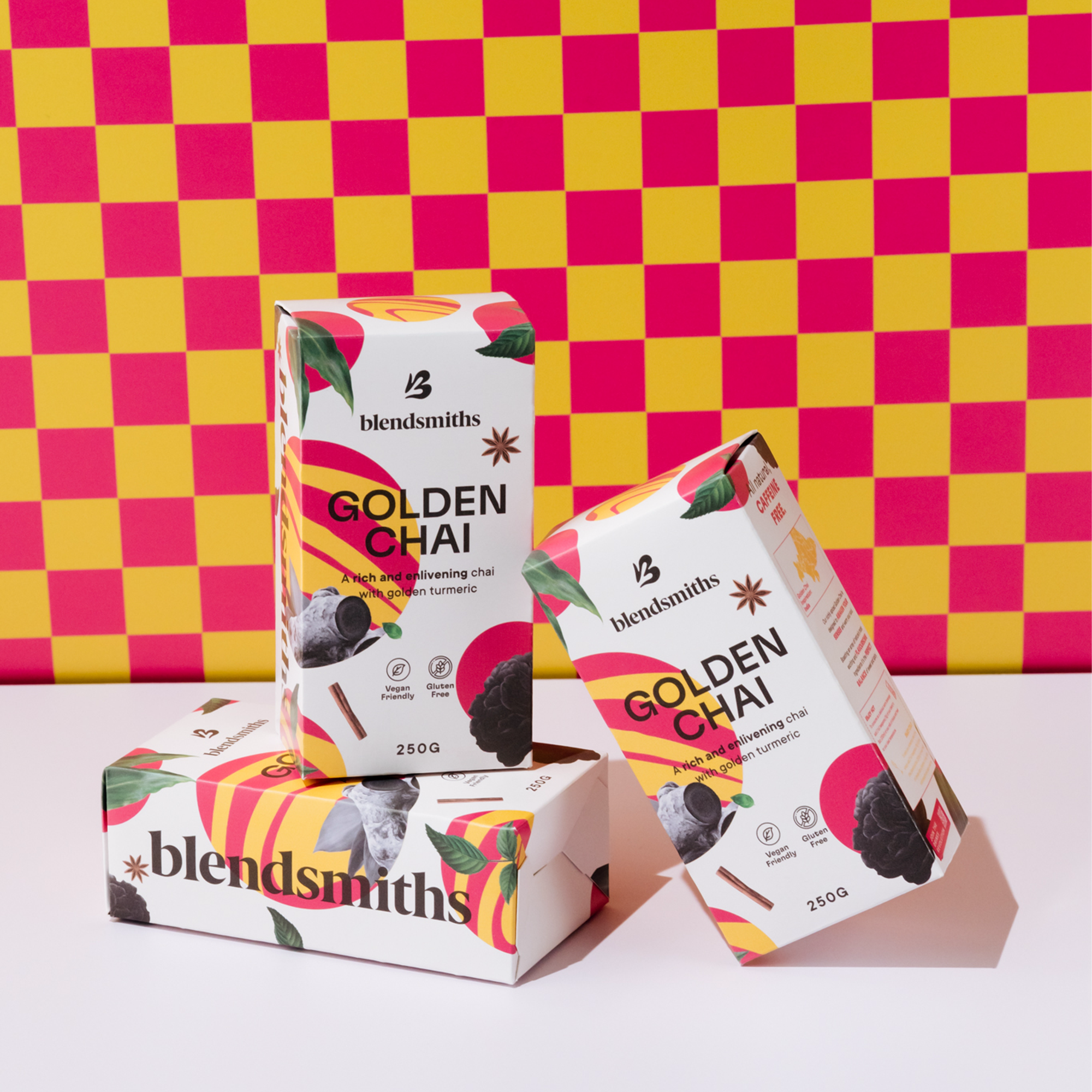
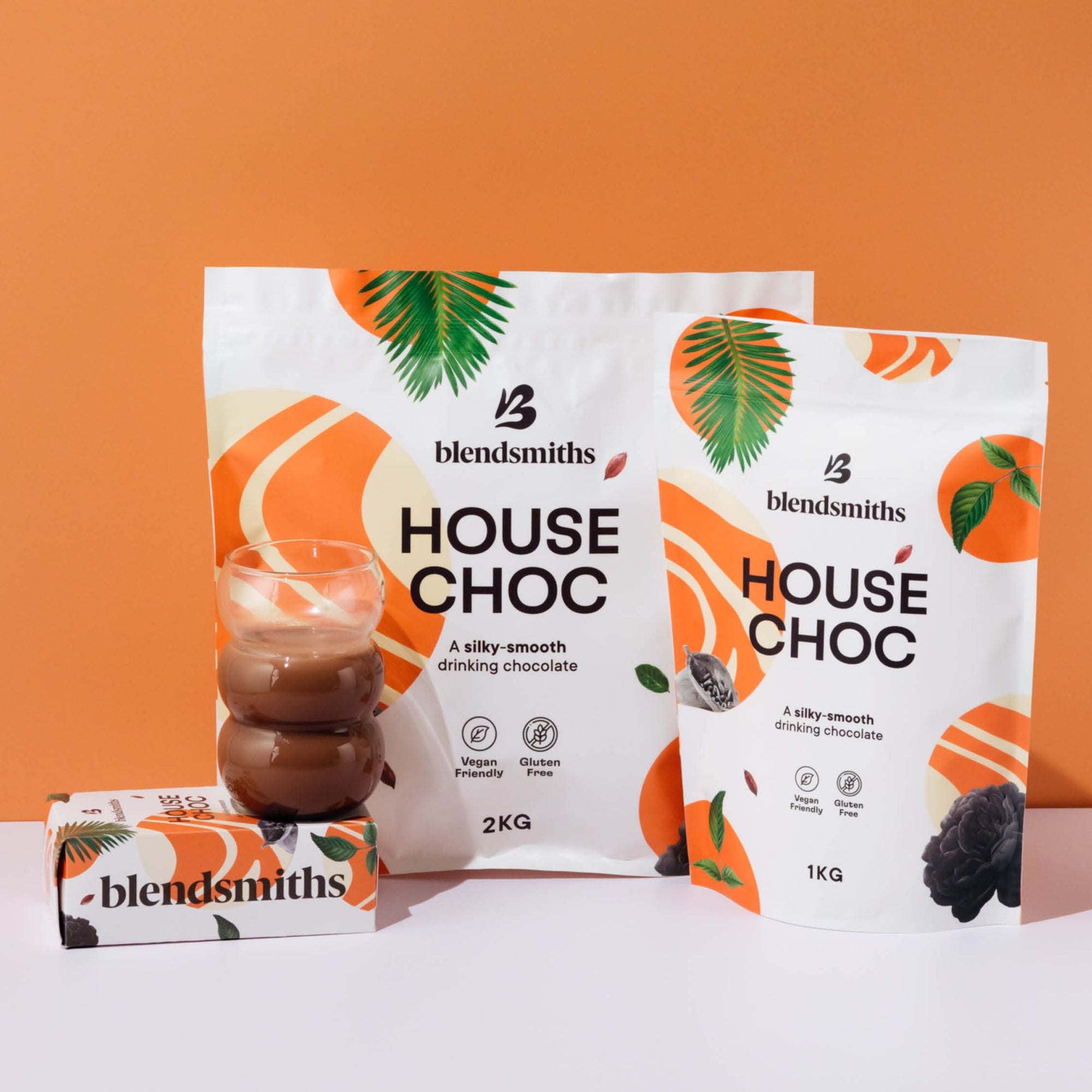
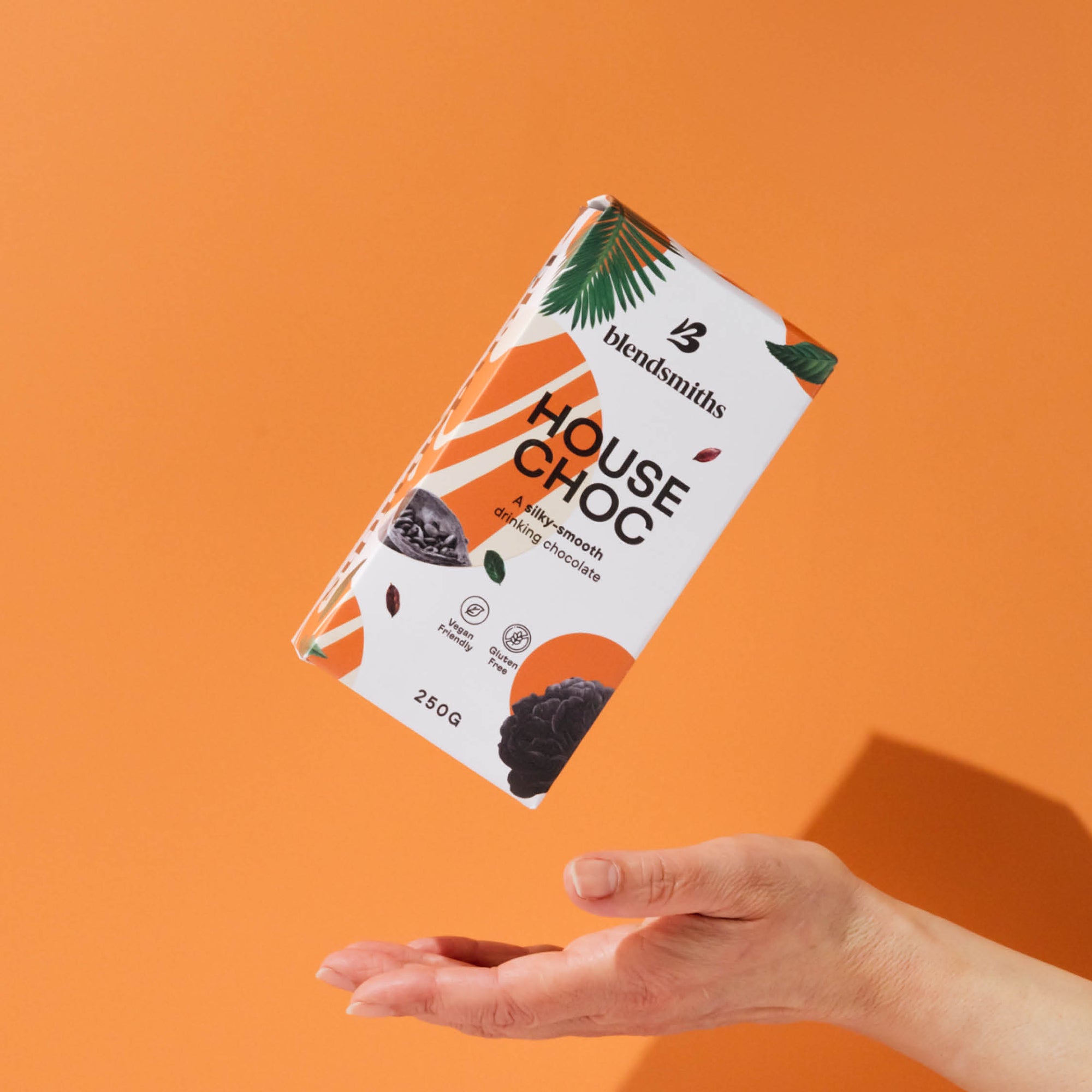
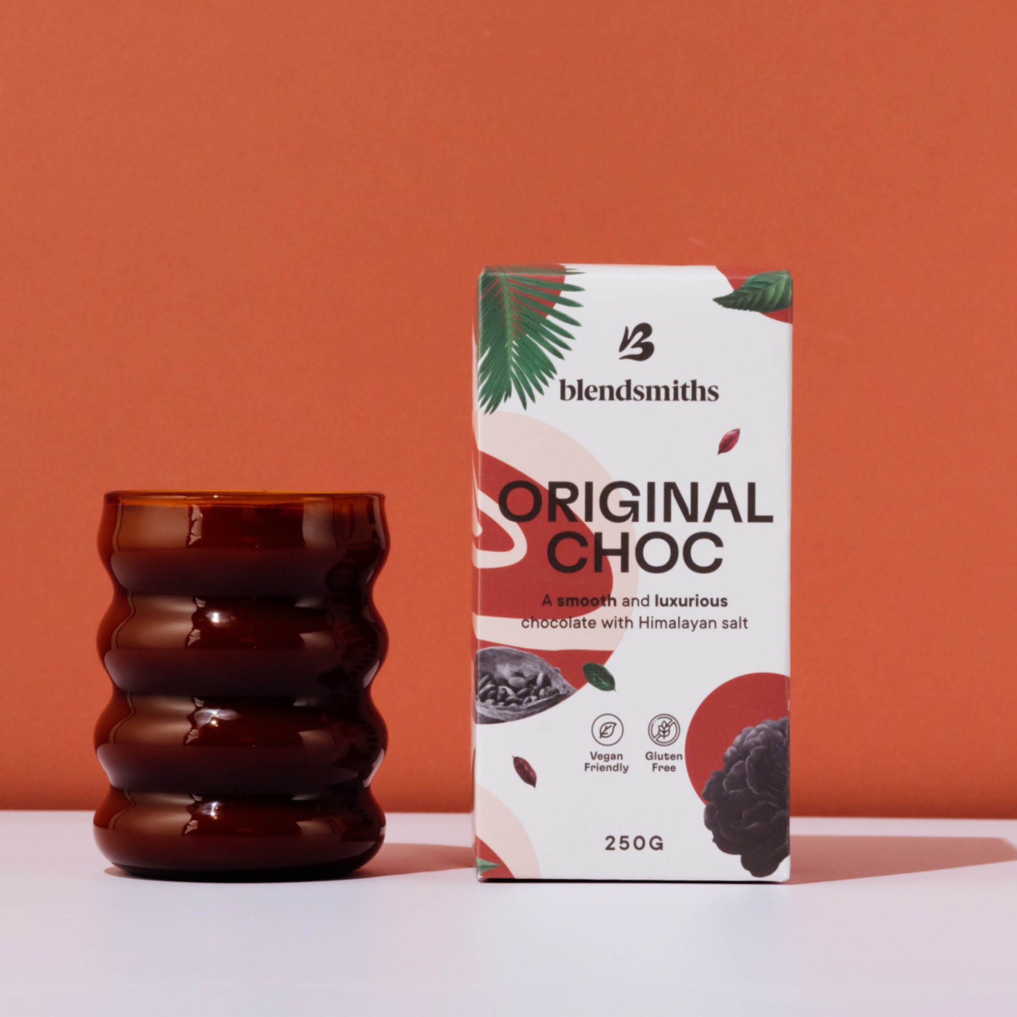
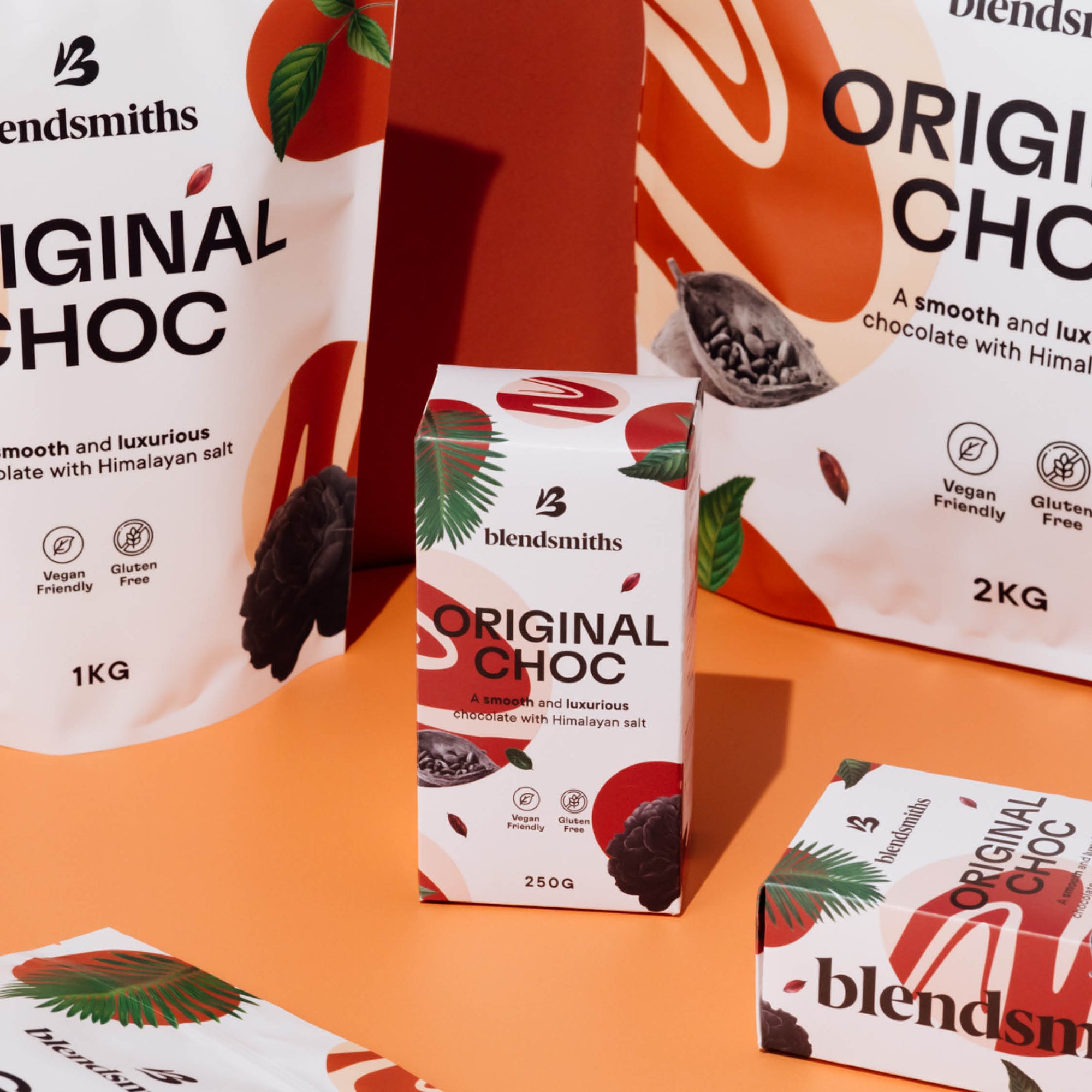
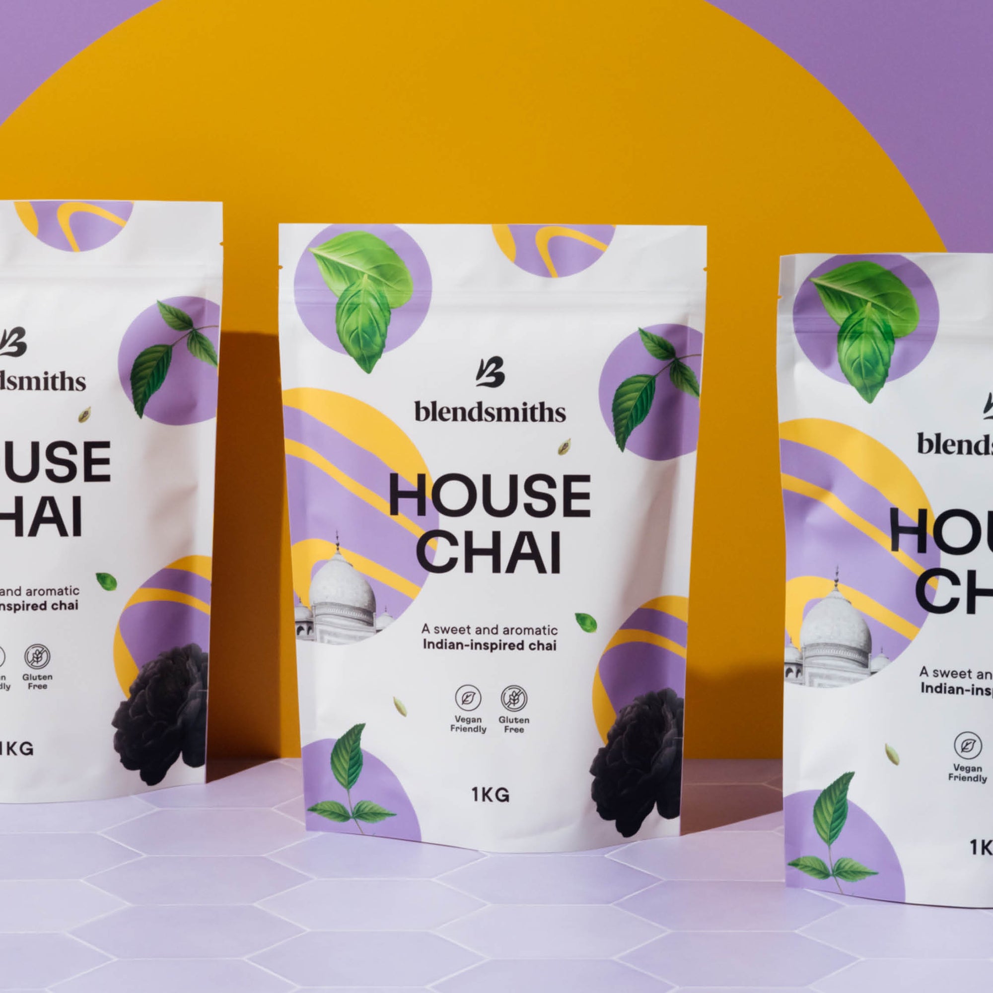
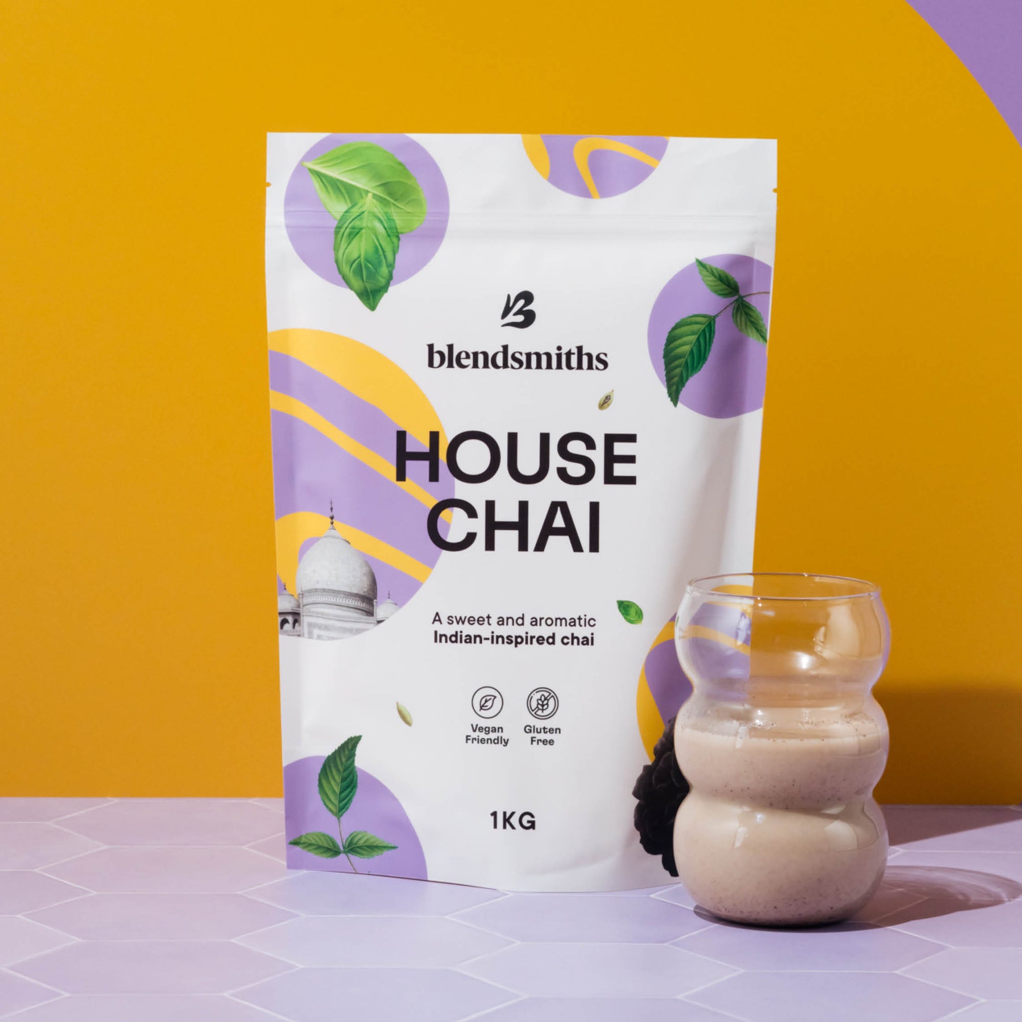
Our packaging had to trigger a multitude of senses. The bags chosen were focused on texture, the recyclable material used is soft to touch, smooth and has a matte premium feel.
The hand drawn sketches show elegance, a human touch and a nod to the ingredients contained inside the package.
The white bags symbolise clean, healthy and the brightly coloured pastel labels denote the colour of the product – designed to attract, intrigue and amplify the explosion of flavour contained inside.
Think Coca-Cola, it’s not the most attractive looking beverage in the world but if you’re Coca-Cola how do you want it to be perceived? The red and white logo was the perfect symbol for ‘authenticity, deliciousness and refreshment’. The glass bottle was slim and was easy to hold.
I love this quote from the Executive at the time. “If Coca-Cola were to lose all of its production-related assets in a disaster, the company would survive. By contrast, if all consumers were to have sudden lapse of memory and forget everything related to Coco-Cola, the company would go out of business.

In a previous life, I worked in project management for a major brand, Durex. The company would spend millions on developing products based on sight, smells, textures and overall experiences, it was a great introduction into the intricate detail and importance of sensory marketing.
I later took this with me into the coffee industry, helping customers to maximise their café space. Utilising the learnings of Charles Spence, teaching the learnings of what type of music to play in the mornings, the colour and shape of the plates used to serve food, the weight of the cups to serve drinks, the look of the front door, where the kitchen should be in relation to natural smells.
In my opinion, Charles Spence research is profoundly awesome. You may be bound by constraints on financial spend, hell we were/are. We have so many ideas on how to maximise customer experiences, but listen, you can start out with the smallest of changes that can have phenomenal results.
Try not to isolate the outcome of a particular matter to your own feelings. Open the sensory book up and let the creative juices flow, you would be surprised at the multi-layered ideas that are scribbled on paper by the end of the day.
I encourage anyone to type Dr Charles Spence into their internet browser, whether you’re starting a brand, a business, hell you might just wanted to change things up in your own home. He has published more than 500 articles in top-flight scientific journals over the last decade, there is a whole world of exciting studies out there to enjoy. Most are short articles and not too arduous to read.

